Saturday, December 3, 2016

How to Decorate a small or odd space in your home


Many times it is asked how to achieve a comfortable and spacious feeling in a room that is small. Though a challenge, the ability to maximize on the limited space can be achieved if you follow certain common sense rules. Most people will tell you the problem room in their home is often odd shaped, small and low light. These issues will be addressed to help you reverse that feeling, since the space isn't always possible to enlarge.


Odd shaped rooms-
Odd shaped rooms are particularly challenging when a homeowner tries to decorate and furnish it. One key thing here to remember is the actual definition of the room. Rooms should always be defined by primary use. This doesn't mean it can't function as other things but the primary function of the room should be evident and prioritized. That being said, odd shaped rooms have to be treated like any room. For example, an "L" shaped room needs to be decorated as if it is a rectangular shape, since the predominating shape is still rectangular. The odd remaining space could be sectioned off, partitioned, or used for the secondary function the room may serve. By defining the primary shape of the room, you can focus on the positives and give the room a personality that overcomes the odd shape.


Rooms with little light-
Most all rooms have at least one window. If the window affords little light it is a real challenge to bring the feeling of natural light into the space. Even in low light conditions, there is always usually one source of light occurring in the room. To find the direction of this light, look for items in the room that cast a shadow, the light source will be coming from the opposite side. This is best done in an empty room during the day with no lights turned on. Once you have determined where the source of light does emanate from, there are a few things you can do to capitalize on it. If your walls are in good condition, choosing warm semi gloss creams on the wall will bounce what available light there is. Placement of mirrors in the rooms where they may reflect and bounce light is a good strategy as well. Don't think just because an area of a room is darker that a mirror won't work, in fact many times this is just what it needs. Mirrors and semi gloss paints bounce light around, forming criss cross patterns throughout the room. If your ceiling is smooth, paint in a high gloss paint, which affords the most reflective ability. This will cast light downward into a dark space and also work with the other light that is bouncing around, real and artificial. If your ceiling is the standard "popcorn" ceiling, if possible, scrape smooth as this is well worth the trouble.


Small rooms-

All the above plus this- always consider function, comfort and scale with small spaces. Once you have the function of the space defined the next question to address is the comfort needed to use the space. For rooms that are used only occasionally, comfort can be sacrificed a little in the name of visual appeal. If the room will be used daily, comfort takes the lead in the priorities and therefore, scale of the pieces need to be considered. With all cases of small spaces, you have to have the right scale of furniture to make the room comfortable and livable. Consider love seats instead of sofas, ottomans (with storage) instead of coffee tables,nice trunks are also smaller in scale and work nicely in a small space. Consider floor lamps instead of end tables, and keep clutter to a minimum. Keep in mind that even if the floor space is limited, you can always maximize the vertical spaces in the room with shelves and shelving units. Sometimes the best way to maximize floor space is to look "up". The walls are also an important way to get storage. Just be careful not to cause too much visual clutter. One way to reduce visual clutter is to disguise it by storing them in similar items like matching baskets, canisters, etc. The eye sweeps across "like" items and always seeks out things that stand out. By minimizing what "stands out" in a room, you literally give the impression of more space.

Thursday, October 20, 2016

Kitschy Design

One sort of interior design aesthetic you don't hear a lot about online or on television is "Kitschy" design. Interior designers and decorators alike usually will not address this design look because it goes beyond retro and into an area that may or may not reflect (good taste).

Kitschy is defined by Merriam Webster in simple terms as anything that is low brow or tacky, cheesy or of low quality. 

That being said, it does have its own following and fan base of those that remember seeing examples of Kitschy fashion, decor etc. In fact you may have seen examples through out your childhood in your grandmothers home. The way I would describe this design aesthetic as it relates to home decor is to say it's retro meets shabby chic at the flea market in 1945. Hows that for painting a picture?

Kitschy has an appeal all its own, those that gravitate towards it find the retro flare, the colors, all to be nostalgic and somehow familiar and heartwarming. When we channel our inner Betty Page, we find Kitschy decor and art not far away.. it was a time of scandalous colors, and behaviors, but a time most of us look at today and go, "ahhhhhhh....those were the good old days.."

Kitschy is a look for those that simply will not conform to norms. Can it be done in a home successfully? Well you'd have to decide what that means. Anyone can design and decorate in Kitschy fashion, simply by googling images of what "kitschy" is.  Will it be easy? You would think so, because the line between being eclectic and kitschy is blurry at times, but easy? Well yes and no. Retro furniture is pricey. Not to say you can't find a similar metal rimmed formica table in green, red or yellow can't be found, but it will either be money for a replica or a great score at an antique mall or flea market. Either way, it will require some effort to achieve. Black and white floor tiles can still be found easily, and if done on the diagonal will certainly add to the flair. Getting retro appliances will also cost a pretty penny. Check out this adorable but pricey refrigerator:
https://bigchill.com/shop/refrigerators/original-big-chill-retro-refrigerator/
or a compact version: http://amzn.to/2eysldP

You get the idea, it will be costly to get the cheap and tacky look today. However, if this is what you love and I can see why, it may be worth all the effort. Decorate and design what you love, the way you want it, life is too short to do otherwise. Kitschy is for those that love to live by their own set of rules. One thing we can certainly say, its not cheap and tacky? Well its adventurous, colorful and fun..if that is what tacky is, sign me up! I want to meet these people that love this style because I know already I'm gonna enjoy their company!

Friday, September 9, 2016

Ceiling Medallions

You've no doubt heard that every room has more than just "four" walls in the realm of interior design. This is very true. To truly give any space a complete transformation, we have to look at all surface areas and that includes the walls, floor and ceiling. Many people tend to over look the ceiling unless it has some huge cosmetic or structural flaw, like the dreaded "popcorn" finish for instance. However, when we look at our  ceiling we can find  an opportunity to enhance the beauty of whatever lighting fixture you go with, and that is where a ceiling medallion makes a great impact.
simple medallion


What are they for?
Ceiling Medallions are often seen in older homes and usually are an accent to chandeliers and lighting fixtures. If you're purchasing them today, they are typically made of Urethane, however you can find them in plaster and also wood.

Cost?
Prices vary depending on size, material used, and detail. The larger, detailed pieces made of wood are going to be far more expensive. You can get some that are simple and smaller from around $15.00 and up. Again, size, material and level of detail play a big role in the costs. Are they worth it? Well, that is up to the individual. However you can also make one yourself. See below.
decorative ceiling medallion

Dual purpose
While they are lovely to look at, they also are helpful at covering up unsightly holes where one may have had to cut a raw opening to install a fixture where none formerly existed. Sometimes this leaves a larger than needed hole and in some cases the lighting fixture base is not big enough to cover the hole. In that scenario a medallion can not only make the light fixture lovely but cover up a less than ideal installation.  Ceiling Medallions have not escaped the imagination of home owners and home decorators though, as they have turned up in a lot of creative ways too, just as wall decor, and small ones have even been used to flank door knobs.

So lets say you have a specific look in mind and you don't want to pay an arm and a leg. Let's say for instance you have some mill work left over, and some handy items like a miter box. You can create your own. Now you may not find it easy necessarily to make a "round" medallion, however this octagon shaped one was not difficult and it cost very little to make.
ceiling medallion


The next time you're doing a renovation, don't over look the possibilities for interest and beauty that can be found when you look up!

Thursday, August 18, 2016

Problem: Tiny 80's kitchen, Solution: Mr. Gagnon, Tear Down that Wall

Ronald Reagan had the right idea. Walls sometimes need to go. Walls can define a space, walls can offer opportunities for storage, or help display art. Generally walls are a good and functional thing. Sometimes though, walls can be a hindrance, a physical block between spaces that keeps energy, air flow and traffic sidestepping, redirecting and congested. In walks this kitchen from circa 1984.

Kitchen 1984


A tight space, and heavily lacquered wooden cabinets. Even though there's a huge bay window, this room and the tiny formal dining room beyond felt dark, and did not flow well. In mid transition, we decided to take the least expensive measures and see what paint would do for this space:


 The paint really helped freshen the whole feel of the space up and brightened things considerably. However the square footage was still a big issue..


One space saving idea was to build storage seating in the eating area. Still tight, but it was a nice little project.
Now the big ideas started coming into play and we realized, while all of these ideas were good ones, they still didn't solve the issue of space to the degree needed. While I was on this journey of changes, I did discover an awesome way to reface cabinets and if  you're interested check out this post:

Easy Cabinet Refacing Idea.

You'll love this easy technique and you wont believe how durable and lovely it is! It's a great refacing hack that you will want to do on all of your cabinets including in your bathrooms!

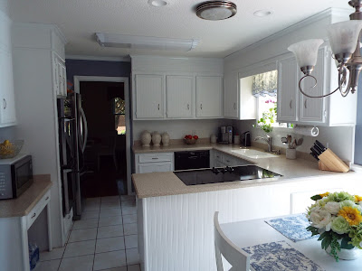
Now back to our program. You'll notice in the photographs there is a doorway opening on the far wall leading into a dark room. This was formerly a tiny formal dining room with only one window. It was stuffy, with no flow, and under used. No one wanted to go into this space. The good news was the wall between the kitchen and this tiny dark room was not load bearing. The solution: Tear down the wall and open up the space to create one large bright eat in kitchen.
Result:


Tuesday, August 9, 2016

Home Staging 101: Bed Making


Home staging is an integral part of selling your home. While some rooms in your home may only need a little nudge, many rooms may simply need a little more. When staging a home, one area I see falling short is in bedrooms. Where is the problem most of the time? It's in the owners lack of  bed making know how. It's not simply selling a house, you truly are selling to the potential buyer a lifestyle.

Bear that in mind and let it be the guide point for your inspiration when staging especially in the Master bedroom which should be the epitome of a lifestyle richly deserved. Knowing how to make up a beautiful bed can go a long way in how well your house shows, and what lifestyle the buyer can have if they purchase your home.  Here's a few tips for the home owner on how to address their beds, especially the Master Bedroom which is the star of all bedrooms.

1. Buy good quality bedding. I wont lie, I am a huge fan of Pottery Barn bedding. I love the feel, weight and quality of the bedding they offer and most of what Pottery Barn offers is wonderful with regards to organic materials.
2. Don't just one stop shop. I like to mix up things a bit. You don't have to get everything from one place to have a pulled together look. Look for bedding ensembles that offer you the ability to mix and match, and the option to purchase as many of a particular item as you need. We've all seen King size bedding ensembles that only offer ( 2 ) Euro Shams, and we all know three is needed for King sized beds. Why is the bedding industry not picking up on this? Luckily, Pottery Barn does offer you this option on most of their bedding products. When will the rest of the world catch up? In the photograph, the bed has a Paisley print duvet, solid sheets, and a matelasse coverlet. This keeps things interesting, but I did purchase the matelasse from JCPenney. It's a great way to add soft texture and break up a strong pattern like Paisley.
3. The 3 plus rule works well for King size bedding. What is the 3 plus rule? Simple, Starting at the headboard, 3 Euro Pillows as the background "plus"  2 King Pillows "plus"  2 accents, plus one final accent pillow in the front.  Bear in mind this is one suggestion, you can do others too, its just a good starting place.
4. Keep it simple if you're new at this. If you're a little worried about going all out, just remember to keep it simple. That means, simple colors, simple layers and simple accents. A well made bed does not have to have tons of pillows or lots of textures, but it does need to follow a simple formula. Look on websites, and see how the pros do it and then see if you can find a happy medium. Good luck with your house staging~

Open Concept Floor Plans: Is this always a one size fits all deal?

Why Open floor plans aren't always the best option


Open floor plans are no doubt something you've heard many times over. You've heard it when house shopping, you've heard it on renovation shows and you've likely seen examples of it in magazines. You've likely heard a lot of chatter about how desirable it is if you're selling your home or want to renovate. So there is no doubt this current trend is in full force and chances are it is going to be a permanent fixture in the world of home construction and architecture. 

You've heard the good. Have you considered the bad? Well, in spite of precious few articles and information on why it's not always the best choice, it really needs to be considered fully before you sign the dotted line or jump and make a quick decision. Here's some things to think about before you decide what you'd like versus what will work for your life, now and in the future.

In magazines, open floor plans look spectacular. In reality, open floor plans can make furniture placement, and decorating a nightmare. Walls not only provide you with a great place to display artwork or add storage via shelves, but they also help with placement of furniture. If you have the typical six piece set up for furniture, such as sofa/love-seat/end tables/coffee table, walls can give you more identifiable placement options. Usually big walls are ideal for sofas, mid-size for love-seats and so on. No walls means furniture must float in the room and this isn't always easy to do. Defining a focal point can be a challenge if you purchase a home that doesn't have a fireplace or some other obvious feature. One thing to also remember is open concept doesn't always equal large spaces. To "float" furniture adequately you must have enough space to navigate around each piece. Open concept smaller homes could possibly mean eliminating some of your existing furniture. Unless a home has electrical outlets in the floor you may find it challenging to have lighting from lamps as well.

Open floor plans can make it harder to keep little ones out of the kitchen. While you may want to be able to "keep an eye" on little Billy, having him underneath you while you're cooking could be an issue too. Falling, bumping and tripping over little ones can be a real safety hazard. Think you're off the hook if you're an “empty nester”? Not necessarily. Grandchildren will be running throughout your home as well which means constantly policing invisible borders between living spaces and kitchen areas and that can be exhausting as well. Don't forget, stoves with front knobs are easy to turn on for little ones and oven doors can get hot and hurt at that level too.

Open floor plans demand you be a little tidier than you may want to be. If you're not the tidiest of people, open floor plans are either going to make you step up your game and clean more diligently, or you're going to find yourself struggling to hide your mess.

 Something to think about as well. If you're an excellent housekeeper this would not be an issue, but if you're a busy mom or dad, this might be something to think about. 

The bottom line is this, don't be fooled by what may be the latest fad and assume this will be the best solution for you. There are no “one size fits all” floor plans and careful consideration of both now and future should be factored into any decision you make.


Wednesday, August 3, 2016

Why white is a timeless home design color choice


New color trends are emerging in interior design every day. One color that always shows up as a color choice in design is "white." In fact "white" is becoming the primary color in not only kitchens but throughout the home. No longer is "white" being designated as the go to "accent" color in spaces, but taking center stage. Thanks to home improvement shows like "Fixer Uppers" and others we're seeing an increased desire to use white with rustic overtones to create warm, yet timeless design.

refaced cabinets using wall paper
Photography by Dawn Gagnon
 While it's being called a trend right now, it's always been a classic and that means its typically safe on all sides of the coin in design. White, is not a new color in design or decor by any means, but today we're seeing more of it than in recent times and that suggests a desire for tranquil simple aesthetics. 


What makes this trend so popular and workable is that it has many advantages over traditional neutrals. Once you start looking at examples where white takes center stage in a space in homes, you'll see why.

Granted "white" may not be a good fit for everyone. Families with children may shudder at the idea of having too much white in any space. Visions of little hand prints, smudges and mystery smears may frighten many of us from such a color. However, white should not be excluded entirely. For example, contrary to popular belief white flushes out stains, streaks and smudges quite well in kitchens. If you use the right type of paint, clean up can be considerably easier as well.
 
The kitchen in the photo had cabinets painted in high gloss white. High gloss paints are usually ideal for kitchens and bathrooms for their ability to resist moisture, as well as better adherence to surfaces compared to semi-gloss paints. Clean up is usually superior as well since most any stains and smudges can be wiped off readily with a damp cloth.


Consider safer shades, like antique white if you find bright whites to be too stark. They are softer and warmer and still do a lot to brighten up a space. The chief advantage to all white pallets is the way the highlight your colorful accessories. Nothing will draw attention to your love of color artwork, accessories, and fabrics like white will. It can transition between contemporary and rustic very well too and that makes it extremely versatile for a design choice. 

Next time you're about to re-imagine a space, check out examples of these spaces where white is the primary color and see if it doesn't inspire you to give it a try.

Saturday, July 23, 2016

Renovation Reality Check

So often we become inspired by the renovation shows we see on television and we gather up motivation to do the same in our homes. More often than not we are faced with the brutal reality of the renovation world, and that is it is much harder, more costly, and more time consuming than what is portrayed on television.  There are other concerns as well. This is a renovation reality check.

High end finishes in a low end area-
Concern one is make sure you understand your home and its market value! Not planning on selling? Doesn't matter, you still need to know. Why? Because not knowing what your local housing market is doing with regards to improvements and finishes can come back later on to bite you. Always, always do what you love, but understand what you love may not always pay off later, even if you aren't trying to sell. High end finishes are beautiful and seem like the way to go provided you have the budget for it but if no one else in your area are doing high end finishes don't assume your high end finishes will necessarily command top dollar.  The bathroom photograph to your left shows improvements made to a starter home. No high end finishes were needed, just an improvement in this homes function and pleasing to look at was all it took to get this little starter home sold after three showings. Incidentally this bath renovation was done under the assumption that the homeowner was not moving any time soon. However, as this post states, life can change on a dime, and this renovation was done in keeping with what the market in the area would bear, and thus paid off.


Your home's "potential price point "-
Your potential price point may suggest that most buyers will not necessarily expect nor want to pay for high end custom cabinets, etc. Still think you don't need to -concern yourself with what a buyer may want?  Remember the future is the great unknown. Life changes on a dime, sometimes we're forced to sell due to illness, changes in lifestyle, jobs, etc. So even if you don't think you're in the market, design and plan your renovation as if you were, it's just smart thinking.

Your home's "potential buyers" -
Know your potential buyer. Again, regardless of whether you think you are going to sell or not this is a good guide in place for your renovation reality check. Ask yourself if your home would likely sell to well established large families, couples just starting out, or something downsizing retirees would gravitate towards. Why is this necessary? Well a big home with 3 or more bedrooms would likely appeal to a family with teens, and middle aged parents, a smaller home with 2 or more bedrooms would appeal to young first time buyers, a home with 2 or less bedrooms and on the small side might appeal to downsizing retirees. All ages will have different expectations with regards to form, function, layout and finishes. Young first time buyers may want modern looking upgrades, but not necessarily expensive high end. Chances are if it looks modern, even if it isn't expensive they will appreciate it.  Middle aged established families will notice the size and bedrooms of your home and  no doubt expect a little better quality in the design and finishes. Not necessarily high end, but cheap will get passed by.

Don't go on  a sentimental journey-
Knowing your homes market value is tricky. Do not let sentimental value effect your judgement. This can mean loss of money not a gain. Check online realty sites like Zillow.com, Trulia, etc. and look up homes in your area. Many that are for sale have multiple pictures. Focus on the homes in your area that are same size square footage and are similar with regards to bedrooms, etc. Study the photographs, what sort of finishes are they using in their homes for the price they're asking. Try to be analytical, not critical.  Notice what selling features are mentioned in the listings. Does your home fall inline with these features? Whether you go high end or not, as a homeowner you can not afford to make costly errors in judgement.

Friday, July 22, 2016

Private Mortgage Insurance, Homeowners Insurance, and Home Warranties Oh My..


So you've bought your home and can't wait to start designing and decorating it to make it truly feel like home.  Owning a home is a huge undertaking and responsibility, so in this article I'd like to talk about something a little different but important to know as you start living in your dream home.

There are three things you are probably becoming aware of and they are the following:  Home owners insurance, PMI insurance and Home Warranties. If you purchased a home recently you've no doubt been required to not only have PMI insurance and  Homeowner's Insurance on your new home. PMI is for Private Mortgage Insurance and it is added to your mortgage payment and is required by your lender to protect them and their held interest in your home in the event you should default on your mortgage.

Sadly enough it does very little for you in return. If you default your credit will not be protected nor will the insurance make good on your default loan amount. It is simply money you will pay to get the Mortgage company to assume the risk involved with loaning you the necessary funds you need. That is it. In a nutshell. So for new home owners do not assume it will protect you in any way. It is typically required for loans where a less than 20 percent down payment is offered toward the purchase of the home.

Home Owners Insurance is paid to cover damage to your property from various occurrences like fire, storm damage, etc. The key thing to remember here there is a deductible involved that will come off the top of any claim you may have, not to mention once a claim is filed, if the amount is high, there is a very good chance you will see a hike in your mortgage payment at some point as a result. You'll want to think long and hard before going this route should your home suffer damage. Especially damage that you may be able to pay for and repair yourself.

The other caveat is that your Mortgage company controls the claim funds. In almost every case your Home owners insurance company will make the insurance check out to both yourself and your mortgage company. Here's the issue, you can't cash the check without the Mortgage Companies endorsement, which means you have to endorse it and send to them. Think they'll endorse and send right back? No. Your mortgage company will want to make sure that any damage the property has sustained was in fact repaired before they send you all of your funds. Typically speaking they will require loads of paper work from both your insurance company and your contractor. They will then send you a portion of the check to begin work and withhold any funds until they've inspected the completed job. This will not happen over night either.

Does it end there? Not necessarily. If you're behind on your mortgage while they have the insurance claim funds in their possession, they can apply the money to your loan and not send you the remaining money. Be sure to stay current during the entire process. Sounds frustrating and potentially not worth it? Well it is something to consider beforehand.

An option to filing a homeowners insurance claim is to find a reputable Home Warranty company and consider going that route for home repairs. Be mindful, most of the Home Warranty programs out there do not become effective immediately and they all range in price but do offer flexible coverage options and monthly payment plans. This may be a better route to go, but be prepared to wait out that period before your policy becomes active. Read the fine print too to make sure of exactly what your coverage includes and does not include.

Wednesday, July 6, 2016

Refinancing your home


Homes are staying on the market longer and home owners are struggling with finances.  In these economically stressful times, homeowners are constantly looking for ways to save money. It is important to make  financially sound decisions that will have a positive impact on what seems to be an uncertain future. There are many things to consider if you are currently wrestling with the idea of what makes sense, and what may not make sense regarding your biggest investment. Here are a few things to consider:
What is the objective?
Lowering your monthly obligation-
If you are looking for relief on monthly payments on a current 30 year mortgage, refinancing could be a smart move, especially if you are considering switching from a conventional to an FHA mortgage. FHA has somewhat easier terms to qualify for and you can qualify for future streamline refinancing each time the interest rates drop.
Note: If the rates are less than 1 percent of what you are currently are paying, give plenty of thought to this move. Refinancing will bring up your pay off amount and this is a factor. Be prepared. You will have to have your home appraised and or inspected. Make sure you do the necessary steps to get your home in order first.
Cashing In-
Tapping into home equity-
If you are looking to cash in on your home's equity, refinancing at a lower rate while pulling
cash from the home's value   could be an alternative as well. If your home is in need of updates, new furnace, air conditioning, roofing, etc. this would be a good time to take advantage of a cash out refinance. This option is great for those who have either lived in their home a while, or paid a large down payment when they purchased their home. Make sure to put some of the cash into updating long overdue improvements.
Your home's pay off should be considerably less than what the market value is  for this to make sense financially. A word of caution though, most homes have experienced a drop in their market value over the past few years and you may be in for shock when your home is appraised. In a courtroom, lawyers should know the answer to the questions they ask in advance, and you should have an idea of home value before you fork out appraisal fees. This is especially true if your loan approval/refinance will be contingent upon your home appraising at a certain amount.
Visiting sites like Cyberhomes and Zillow should yield some reasonable idea of what your home may be worth currently. Also consider your current credit status. Don't wait until your credit is in bad shape to suddenly run and try for a cash out refinance. Banks have tightened the reins and even Credit Unions are not as forgiving as they once was regarding credit. Never wait until you are desperate to try and save a sinking ship. Try to spot the storm in advance and make your move while you still have a chance at success.

Shortening that mortgage term- Switching from 30 years to 20 or 15 years-

If you bought a home a little later in life and you went for the 30 yr. fixed rate deal, you probably did not consider the fact that you may not live to see your home paid for. If you bought your home with no down payment/100% financing your equity will be long in coming. Shortening your mortgage note at a reduced interest rate may yield a slightly higher payment, but could mean spending your golden years traveling and having fun instead of paying a mortgage on a fixed income.

A man of fifty would be wise to consider shortening a 30 yr. fixed rate note to a 15 or 20 year mortgage at a reduced rate. He will build equity faster,  which can come in handy later on if an emergency arises. Many banks and finance companies are now offering bi-weekly payment options your new 20 or 15 year mortgage can actually be paid of in an estimated 16.5 years and a 15 yr. mortgage in 13.5 years.

In about five years time your mortgage pay off will actually be less than it would have been if you had not refinanced at all, even with the hike in the Principle balance from the refinance. The bi-weekly option pays your home off faster due to the 52 weeks in a year, which actually seamlessly allows you to pay more than you realize without feeling the impact of it financially. Now consider that your home may increase in value in a five year period,(with emphasis on "may")you are way ahead of the game.
Tips:

  1.  At closing remember, you will need a certain amount of cash and typically you will be required to have a witness present. The witness must be atleast 18 years of age.
  2. 2. Check your credit report and pay down credit cards and debts prior to a refinance. Make sure there are no negative errors that can hinder or impact your refinance ahead of time. Try going to sites that offer free credit reports.  
  3. Have some savings. Try to have some money in your savings account, ideally $1000.00 wouldn't hurt.
  4. Research your homes value, make lists of current improvements you've made that are not included on sites that give a market value. You want these improvements to be noted.
  5.  Make improvements, etc. to your home prior to appraisal and inspection. Be ready to answer questions about your homes roof and how old it is, and make sure outlets, smoke detectors are all in working order.
  6. Shop around, different lenders offer different packages. Do not be so sure your bank or credit union has the best deal, just because you're a customer or former customer. Loyalty does not always translate into a better deal for you.
  7. Pay close attention to the fees involved, and note how much this will increase your pay off on your home. Make sure if you go with a lender that they are an approved FHA lender, and have a good reputation. There are sites online that you can investigate customer satisfaction. Do so.

Wednesday, June 8, 2016

Coming up with your own design philosophy

One thing that I can not stress enough is how important it is to have your own ideas and philosophy in your home's decor and design. Too many of us are swept up in what we are told by the industry is the best look for our homes, but few of these sources know your individual living needs, or the dynamics of your family and home life.

This is why it is important to develop your sense of style based on what you know about yourself. Now many have expressed to me that they don't always know what their design style or philosophy is, and I can understand this completely. It's not necessarily a cut and dry assessment. Chances are though, your style is right under your own nose, or you may even be wearing it. This is something most of us don't realize but the way we shop for our clothing, our cars and even the homes we pick all lend themselves as evidence to what our real style is.

Once you come to know and embrace your own individual style and philosophy, it becomes easier in time to know what you like and what you don't, what works, what wont, and ultimately what will make you happy. Designers, Decorators all can tell you what industry standards are, they can suggest and offer ideas but if you don't allow or develop what your philosophy, you will soon find yourself living someone else's dream and not your own.

When you do seek out the advice of someone like an Interior Designer or Interior Decorator (like me) be sure to find out what their philosophy is and decide whether it mirrors any values you hold near and dear. I truly believe my job is to help you, or the client find their own philosophy and design style. Once I have that as a template, it is then my job to use my skills in getting what is in your mind, in your life in the most creative, beautiful way that works for you on multiple levels.

So here's my tips to help you find your design philosophy:

 Look in your closet. Examine your favorite articles of clothing and footwear, jewelry, and accessories. Ask yourself what it is about these items do you love.
Walk around your home.  Take note of your artwork choices, furniture, flooring, wall color, light fixtures, plumbing fixtures.

Here's a check list you can use:
1. Color
2. Texture
3. Comfort on a scale of 1- 10
4. Durability
5. Usability- in other words, how often do you find these items as a go to, and why..

Notice Repeating colors, finishes and textures
List these repeating colors, finishes and textures

If you're seeing a lot of repeating metals, finishes, colors etc. then you've probably found a good starter list for what your likes are.

Sunday, May 29, 2016

Easy Coffee Table Decor

Every so often I like to post these little ideas I get on the fly that are so easy and simple I question whether to write about them. This particular idea is one such post.
I am always looking for something cute that can be customized to match your color scheme and be inexpensive.


Decorative sphere's all assembled in a bowl are lovely for the coffee table.  However I could not find the particular colors to match my current color scheme in my family room so I decided to get some left over yarn, and styro foam balls and cover them in yarn. The great thing is you can get styrofoam balls in different sizes and this helps when you just have left over pieces of yarn from your knitting or crochet projects. Add a cute basket and voila, a simple way to use left over yarn and make a centerpiece for your coffee table :D

Family Room Before and After


Hubby and I are constantly dreaming and scheming with ideas for home design. I believe to truly be able to help others, I have to make sure each idea is tried and true. When moving into our 1984 Colonial home we knew our dreaming and scheming would have to take charge and our individual skill set would have to come into bear.  On the list first was the large family room which was stuck in a time warp.


My belief, as an Interior Decorator is that trends are not where it is at in home decor and design, but timeless design is. That being said, I love to take an older home that was built in the 70's and 80's and leave my visitors guessing as to the true age of the home. That means "de-dating" it. When a home transitions from 1970 or 1980 it should glide into "date unknown." Why? Because that is lasting design. If you can't date the home you're looking at visually, you've done it right in my book. That means merging the past and present in clever ways and it should not mean costly updates.


The family room was dark and dusty before we took it into a new direction

Now I understand there are people out there that will love this look, and say leave it alone. My response is, if grass cloth wall paper and pine tongue and grove paneling "float your boat" by all means embrace it and love it. At the end of the day we all have to love the space we're in and I say do what you love. If done right almost any design can be a great feature.

Our family room before was a huge dust trap in part due to the glass cloth wall paper. It was also dark for my tastes so we decided to strip as much of the grass cloth off the walls-- a nightmare and go with textured paintable wall paper. We also painted the tongue and groove wood work. Sorry guys, but it's always a personal choice and I can't stress this enough, "do what you love."
Family room before and after


This is just one more example of what paint can do to a space. Depending on what you love, it can re-create a space. What I love is, it blurs the line a little between yesteryear and today.


Friday, May 27, 2016

Easy cabinet refacing idea

We all have had cabinets from one home or other that had old, original cabinetry that could use repainting, replacing or refacing. All ideas have their pros and cons but you can do this easy trick to get an awesome new look to your cabinets.
The cabinets in this kitchen were originally your solid dark wood cabinets that were built with the home in 1984. As shown in the photograph below:


The cabinets were in great shape, with a heavy lacquer finish. Overall the kitchen felt extremely dark even though it had a huge bay window (not visible in this photograph) to the right. The idea was to keep the cabinets since they were solid wood and paint them. However, the first go around with paint left much to be desired. Hubby used semi gloss paint and as a result the cabinets needed touching up every few months. They also did not wipe clean very easily and if one scrubbed too hard you took paint off. We could have removed the lacquer and stripped them down but with a long list of renovations to undertake, we wanted a simpler solution.

Here's an up close picture of the cabinets with the textured wall paper applied and painted:


The idea: High gloss paint and wall paper. Yep, wall paper. Textured to be exact. This idea has held up well over the past six months. That is how long I test an idea before I decide to write about it. We did not clean, scrub, or do anything special to the cabinets. I went to a favorite standby of mine, textured wall paper, with a bead board relief. We did not wet the pieces but cut them to size so that they fit into each cabinet door inside the mold frame work. We also did not wet them in water and then gingerly applied the pieces, we simply painted on wall paper paste on each cabinet door, and applied the dry cut wall paper pieces over the paste. and pressed into place. After that was completed, we waited to the next day and simply gave everything a fresh coat of pure white high gloss paint.
The result:


 This technique was not that expensive, a gallon of high gloss white, double roll of textured prepasted bead board wall paper, and wall paper paste. All new cabinets, and they wipe down easily, on both the painted wood AND the wall papered sections. It's six months and they still look new!! Give it a try!!!

Wednesday, May 25, 2016

Taking a vision to reality in home design

One thing I know for certain is that you can not be afraid to take risks. As the saying goes with big risks comes big reward. That doesn't mean to say you should throw caution to the wind or go beyond your scope of abilities, but it just means trying something that is different, and doable.
I work with my husband on every home design endeavor. We both bring different abilities to the table...literally..as you will see what we recently did to this kitchen dining nook below.
dining room built ins
© Dawn Gagnon Photography
I guess you'd say, we existed before Chip and Joanna Gaines of HGTV's show "Fixer Uppers." Which we happen to be huge fans of because they embody so much of what we love and believe and we share the same views in so many ways..
At any rate, this table did not come from a store, well, the base did. The top though was small and round and didn't suit our needs so with my vision and my hubby "The Donald" and his skills we came up with a solution. Simply build a top to the specific size we needed. Some molding and paint for trim and voila, we 're done.
Now the built in storage/benches made sense. Building those was merely about two by fours, one by twelves and wood trim to finish the edges off. I think it came out quite well and offers up the storage that gives the space additional functionality.
I can dream it, draw it, figure the materials and hand it to The Donald and from there he goes. That's how we work. We're a team. Donald is a little more wary of taking one of my brainstorms from paper to reality because he often can not "visualize" what I need until I sketch it for him. Once that happens, and he can see it, it "becomes."

It may not be something you'll see anywhere else, but that is when I like to say "well every idea starts off, not being seen anywhere else..." You truly can't let that be a deterrent. 
Here we needed a fireplace mantle, but I had a specific vision in mind..and with my sketch pad in hand...Donald was able to give this fireplace a cozy new look:


Once that idea came to life, well, you know I had to go further. The dreamer in me never gets rest and The Donald would say neither does he..matching book shelves we next on the list and I designed them to be simple, rustic and complimentary to the fireplace. I would tell others on this endeavor, to always start off with simple ideas and build from there. Experience and success come through trial and error.

Tuesday, May 3, 2016

Re-purposing entire spaces

Often we have rooms that have a purpose but in some cases, they may not function very well for your needs. When we run across these types of spaces in our homes we have a few options. We can make use of the space with space saving adjustments and scaled down furnishings,appliances, etc. Other options may be to see if there is a way to trade off one space for another in order to improve the function of both spaces according to your individual needs. This was the case here in these photos:

This dining room was stuffy, closed off and too small to seat comfortably a group of family members.

Trade off, small unused Formal Living Room will now be the Dining room with plenty of space for everyone.

The bottom line is you can't be afraid to try something new if it can be a better fit for your family. The old dining room now has a new purpose and function, but it can also be easily converted if needs change to a fifth bedroom on the main level, or even converted to a huge walk in pantry that can not only store food goods, but also house a freezer, and other kitchen related storage. For now it is a multi functional office space, with room for crafting, sewing and blogging!