Sunday, November 25, 2012

Christmas Hard Candy Candle project

Christmas candy candles

Jazzing up candles for Christmas
Inexpensive Christmas décor is hard to find in any store, however, using what you have around your home or can buy really cheaply can be fun and cost effective. Many times if done with patience and care, your project can look high end and attractive and can be done for many different seasons and holidays. Try this inexpensive, fun and cute idea:

Supplies needed:

  • 3-4 Candles (you can use any size and color you like as long as they have enough girth to glue hard candy to)
  • Low temp hot glue gun and glue sticks
  • Hard peppermint candy several bags (the cheaper the better)
  • old scratched/ damaged cds


Instructions:
  • It is a good idea to have one spare candle to work on first when doing this project. The practice will be helpful since it will help you figure how to space your candies from each other for the best overall appearance. This will make doing the other candles a lot easier.
  • Select the candle you wish to use, and place it on a paper plate. Working in a circular pattern, come up with the design you want. Starting at the top edge, not the top flat part but the edge, begin gluing your candy and placing evenly around the candle. You can use a cake turn table to make things easier if you have one.
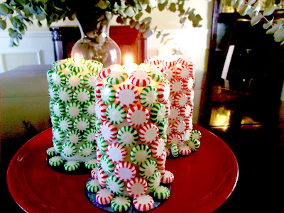
  • Doing alternate colored candies will give you the swirl effect you see in the picture provided with this article. If you do your first row one color and the second row another color of peppermints, then you will end up with a quilted or checkerboard type effect.
  • Once you have covered your candles with the candies, it is a good idea to find some used or old scratched cd's that can be recycled. Place these under your candle. (I glue mine) and you can add little wreaths at the bottom or glue more candy around the base.
  • Tip: Although the candles are lit in the photograph, I would not recommend keeping your candles lit for long periods of time. If you have any doubts, light the candle you did your “trial run” on and see how it fairs under controlled supervision to see for sure. Also do not do this project with young children and a hot glue gun. Even low temperatures can be painful on tender fingers.
For more ideas on holiday décor, see: How to recycle old lightbulbs.

Monday, November 5, 2012

Holiday budget decorating

Hot glue pasta
Hot glue pasta (Photo credit: Wikipedia)
You don't have to spend a fortune on decor if you use many of the items you already have in your home and in your yard.

Tip # 1 Keep it simple
The more you do, the more complicated and expensive it can get. Remembering to keep decorating simple will keep your design elegant and refined and budget friendly.

Tip # 2 Use what you have
So many times we think we have to go out and buy decorations to express ourselves when some of the best decorations we have are already in our homes. Go on a treasure hunt in your garage or attic and look for things you can use creativity and a little hot glue to transform. With a little this and a little that, you can easily re-purpose things you already have.
Tip # 3 Nature calls
Rustic warm decor appeals to almost everyone, especially as the weather gets colder and colder. Look for broken branches, nuts, acorns and pine cones to dress up mantles, shelves and make centerpieces for your tables. These items are free and really warm up a space. FYI- if you don't have a yard or very little yard, consider going to a nearby park or even a beach to find natures little overlooked gifts. Seashells can be given a sparkle by spraying glitter paint and gluing jewels on them and displayed in large pickle jars, and glass vases.

Enhanced by Zemanta

Decorating for the Holidays in 2012

With so many of the nations citizens struggling with economic issues, and hardships, you may believe that worrying about trends is a frivolous affair. However, our environments play a key part in our mental well being and it is in times of struggle that we have to find ways to keep our spirits up, and remind us of our blessings. With that being said, the trends this year have been leaning toward two keywords, “cheerful” and “comforting.” Here are two ways to achieve different effects in your home this year during the holidays.

Cheerful decor- 
Christmas decorations by Albedo 003
Christmas decorations by Albedo 003 (Photo credit: Wikipedia)


Cheerful décor is a means of surrounding yourself with things that you wish to project into your world. Things that are cheerful speak to us, change our demeanor, and thus improve our lives on varying levels. The first thing you have to ask yourself is what puts me in good cheer? What colors make me smile? What do they remind me of? Once you have devised this list, find ways to incorporate these things into your décor. Make a list of colors, objects, animals and things that make you feel happy. Use this list as your inspiration and your theme. Perhaps your decorating theme for autumn and winter months is “new beginnings” or “love and memories.” Then build your décor working with your list of things that make you happy. Winter trends in color this year will be white, with red and green, instead of red and green with white. Just that simple change in how much of each color you have makes a difference in how cheerful it feels. Play around with color and the amount you use, will dictate your cheer levels, so be mindful of how much you use of each you love to see the difference in how it impacts your décor and environment.

Comforting decor 
Pine cones, male and female
Pine cones, male and female (Photo credit: Wikipedia)

Maybe more than any time in recent years, mankind is finding a need to find comfort and joy, which has been a common wish and blessing for holidays for decades. Typically, we find great comfort, in those things that have a warm, rustic feel over the flash and glitz of more commercial holiday décor. With that in mind, think of décor that appeals to all five senses. Warm pine boughs on mantles are no new idea, but they will find a way into homes that at one point may have abandoned traditional décor. Why? Because when man struggles, he seeks out those things that make him feel secure and comfortable. The past seems in many ways a safe retreat from the present. Nature lends itself well to the comfort we seek in décor. Look for simple unsophisticated offerings found in nature to appeal to your personal sense of well being and connection to the earth. Pine cones, trigs, branches, apples, fruit, spices and scented candles will always have a place in décor whether it's the year 2012 or 2212. Remember simplicity is at the core of comfort.

Merging cheerful and comforting decor- 
English: Christmas decorations Polski: Dekorac...
English: Christmas decorations Polski: Dekoracje świąteczne (Photo credit: Wikipedia)

This may be the best design overall. Comforting décor can be raised a level or two by being sure to add whimsy and fun to ordinary or rustic objects. The best way to achieve this may be to take rustic items and craft them into one of a kind bits of fun. Pine cones make great little pine trees with the addition of beads and pearls, twigs and branches that are tied together with raffia and perhaps have a cute elf sitting on top may be just the personality and cheer it needs. Once you open up to your creative side, and you take the everyday into the unusual, magical and whimsical, you have effectively merged both comforting décor and cheerful décor, the result is one hundred percent you, one hundred percent unique.
Enhanced by Zemanta

Thursday, September 13, 2012

How can hiring an Interior Decorator or Home Stager help get my home sold?

English: Subject: Home staged for resale - Fam...English: Subject: Home staged for resale - Family room, kitchen :Location: North Phoenix, Arizona, USA :Date: August 2006 :Photographer: Andwhatsnext :Credit: Work completed by Steve Price/JesmondHomes.com :Original digital photograph, resized :Photo copyright (c) 2006 by Nancy J Price (Photo credit: Wikipedia)


Not all, but most Interior Decorators have additional training in home staging. The biggest challenge in home staging is getting your client to let go of what they currently have tried that has failed and trust that your knowledge in home staging will only help their home sell.

What you can do
As a homeowner you have to be willing to be flexible and give your stager the ability to work with your home. If you don't understand something they are doing ask them to explain the concept to you. Most  stagers have a strategy in place and can tell you exactly why this items needs to be removed, or placed elsewhere. You may have to accept a little constructive criticism as well. If you have a light fixture or piece of furniture that is extremely dated, your stager needs to be able to point that out to you and possibly cover it or remove it. Dated fixtures, furnishings, etc all can be potential deal breakers for buyers. Leave your personal feelings, and tastes out of the equation for the best results.


Français : Exemples de Home staging virtuelFrançais : Exemples de Home staging virtuel (Photo credit: Wikipedia)


What to expect
A good Interior Decorator/stager will sit down and spend a little time just getting to know you. Home staging is not a one day deal in most cases. The first meeting is usually about interviewing you and accessing your homes needs. That may include asking questions about your general habits during the day and evening, what your expectations are with regards to the results of any staging, and what your limits are regarding what you are willing to let a stager to do get your home sold. They will usually take the information, measurements and come up with a floor plan and strategy to present to you on the next visit. Please make sure you discuss what your budget is and see if your stager can work with it. Most quotes a stager/decorator give you are flexible, especially if they are independently employed.

The benefit of depersonalization
When a stager comes into your home and begins removing your personal effects, it is sometimes traumatizing to the homeowner. However each personal object that is taken away allows for the buyer to imagine their own decor in the space. This is ultimately what you want. The more your home looks generic, the easier it is for a buyer to envision their life in the house.


 Français : Exemple de Home staging virtuelFrançais : Exemple de Home staging virtuel (Photo credit: Wikipedia)


The outside should reflect the inside
Many potential buyers will do a drive-by of your home before actually committing to go inside to take a look. If your home lacks curb appeal, you may miss a lot of traffic when you have an open house. At a minimum, keep your lawn cut and watered, and hedges trimmed. It bears mentioning as well that a yard and/or front porch can be just as cluttered as the interior of a home. Treat the outdoor space the same way as the interior space and remove unnecessary, distracting things from your yard.

Eye on the prize
Keep remembering what the goal of the staging is, to get your home sold. The sooner you can cut your personal ties to the home, the easier it will be for someone else to love it, and that means buying it. A stager is not there to resell your home back to you. That is what they do as an Interior Decorator, but when they offer staging services the approach is different, and the goal is different. Always think like a buyer when you work with a stager, not like a homeowner. Your refusal to detach temporarily can mean long term failure and many possible price drops in your home.

The good news
Homes that are properly staged sell faster for more money. By removing your excess during the staging process you have also cut your moving time in half as well. This means getting into your new home that much faster.  Keep in mind, no stager can produce miracle results, and there is no guarantee that your home will sell just because you hired a stager/decorator. However, the odds are that you will sell sooner and for more money with the help than without it. Consider the experience as a valuable learning tool and it will no doubt help you the next time you have to sell your home and that alone will make it worth it.

Enhanced by Zemanta

Monday, September 10, 2012

How do I make my sun room feel finished?


Sun room
The darker furniture pieces help anchor this large sunroom
Dear Dawn,
I have a sun room that was added on to my home several years ago. Once all the work was done I realized it was a challenge to not only decorate, but for some reason it still feels like it is in a state of transition, and not a finished room. Where am I going wrong?
Leslie, Ft. Wayne

Dear Leslie,
One mistake a lot of people make with their sun rooms is making them too different from the rest of the home. If you want your sun room to feel more integrated and finished, you should try a few of the tips listed below:

Pull color from adjoining rooms 
A sun room feels less like an addition when you pull color from the rest of your home into the space. This doesn't mean you have to use the exact color, but using lighter shades in an existing color already present in the home should help the room feel integrated. Try to find furniture that is similar to what your already have and love as well. Don't be lured into buying furniture that looks like "sun room furniture" that looks picture perfect but isn't user friendly or comfortable. This could keep the room feeling not only unwelcoming, but disconnected from the home.

Anchor the room
So many times, we see sun rooms that are light and lovely to look at, but they still feel like a glorified enclosed porch. While sun rooms should be filled with light many times people forget that a few visually heavy pieces can be just the anchor a sun room needs. So what exactly are visually heavy pieces? This can be items with strong presence in the room either in size, color, or texture. With all the strong light usually present in a sun room, you may feel the room has a light, ethereal, floaty feeling that doesn't really say, come on in and get comfortable. Adding a few dark furniture pieces, a bold print rug, or some texturally interesting pieces should help "settle the room down" and make it feel like it has substance.

Make sure the temperature is under control
Believe it or not, humans are extremely sensitive to fluctuations in temperature. A few degrees in either direction can be all it takes to make a room less appealing. Sun rooms that tend to be too warm in summer and too cold in winter will not be utilized to the fullest. If you haven't done so yet, look into adding heating and air conditioning to the space. Light control is important in keeping a room from feeling too warm during peak sunlight hours. Investing in window blinds may be a way to help stabilize the temperature in the room. Consider adding additional sources of heat  and air with electric fireplaces, and ceiling fans as well. 

Enhanced by Zemanta

Thursday, August 9, 2012

Wallpaper: It's come a long way

Grey textured wallpaper
If you're trying to update your homes look, especially if you're trying to sell, paint is not the only option for giving your home a nice new update. While you may have been hesitant to use wallpaper in the past or you've heard countless times how it is a turn off to a potential buyer the truth is, wallpaper is coming back in big way. What wallpaper can give you over paint is it can hide a multitude of imperfections in the wall.

Easy installation- For kitchen and bathrooms, there are great neutral choices that are easier to install like this example: Brewster 425-6004 Trends For Kitchen and Bath Paper Crackle Wallpaper. Why is this paper a great choice? Well it is neutral, and so will not offend most buyers since it will go with a wide array of styles and décor. It has a random non repeating pattern which means you won't have to line up patterns. This saves you a lot of money because there are no extra cuts needed. It's scrub able, peel-able and this is something you can pass on to the new buyer or homeowner.

Damaged walls- How about a wallpaper that will really cover damage? Here's a great solution and it's paint-able so you can make it as neutral as you like: Large Tile Flower Heavy Textured Paintable Wallpaper. This wallpaper gives you all the flexibility you need to customize it to your existing décor or make it an easy match for the next family if you're selling. This is an ideal wallpaper for walls that have a lot of minor damage, scrapes, scratches and shallow indentations. Here's another example: Graham and Brown 13194 Cordoury Wallpaper.

Gray is the new beige- Don't forget, gray is the new beige in neutrals and it is extremely popular today. Gray has found a new following in the décor industry. It pairs well with bright white trim, and dark woods that are popular in many furnishings today. Try using updated modern wallpaper to create a focal point or a feature wall in your home, like this style: Brewster 176-65522 Beacon House Dynasty Foils Petals Wallpaper.


Enhanced by Zemanta

Saturday, August 4, 2012

How to sell your mobile home

Exterior of a modern manufactured homeExterior of a modern manufactured home (Photo credit: Wikipedia)


Dear Dawns Decorating Solutions,
I have a double wide mobile home I am desperately trying to sell. My husband's job is relocating him and we need to sell. Any tips as to how I can get this home sold ie: decorating, staging etc.  It is a late 90's home and is on roughly one acre of land.
Thanks!
Diane Lancaster
(please do not include my email :)


Dear Diane,
Thank you for your letter. You are not alone, it is an uphill challenge today trying to sell any home, but mobile home owners have special challenges over and above the struggles of many. Financing is particularly hard for an interested buyer. Some of the big mistakes mobile home owners make is not updating, and  over pricing their home especially in a down housing market.

Here's my tips and suggestions:

Tip # 1

Price it right. You can usually look up your home and its base value on www.zillow.com to give you an idea of what price your home is likely to be in the ball park on. While Zillow doesn't take into account what improvements you have made into their analysis, it's "Zestimate" -(a term they use on the site for the value of your property) is publicly displayed and is usually somewhat lower than what most would expect. Nonetheless, for those looking, this could impact how much they are willing to offer.


Tip # 2

Age isn't just a number. Mobile Homes reflect the current trends in color and design finishes of the decade they were manufactured. Unfortunately this speaks to the buyer in a negative way because not only does these finishes "date" the home, but it also says it won't likely accommodate your current decor and furnishings. This translates into additional money to be spent. Many buyers are going to be put off by the idea of having to neutralize your mobile home, when they can easily buy a home that is move in ready, even another new model mobile home. If you want a buyer to regard your mobile home as a regular home, you have to treat it as you would a regular home as well that means updating every 5 to 10 years.


With that in mind you have to "neutralize" your mobile home to:

a. Disguise the home's age
b. Make it move in ready
c. Accommodate any buyers modern furniture and decor

This may involve spending some money on your part, but in the big scheme of things, it could mean a quicker sale, and getting a better asking price.

Tip # 3 

The 3 R's 
You may need to take a look at  all surfaces that are not neutral. You may need to apply the 3 R's of updating, Replace, Reface, Repaint.

Replace lighting and plumbing fixtures that are bright brass should be changed too. These cheap metallic finishes would be found on older homes in the lighting, the faucets, the door knobs etc. Change out for more updated finishes like Brushed Nickel, or Oil rubbed Bronze. Replace any flooring that isn't neutral.  Go for neutral friendly carpeting and flooring in shades of grays or beige's. You may also, if your budget allows, may want to replace any dated appliances. Ideally your buyer may want stainless steel, however, it would probably be counter productive to put any high end or expensive versions of these in a mobile home. Opt for new appliances that are less expensive, as they will still be an upgrade for any that are as old as the mobile home.


Repaint oak cabinets that have seen better days as well as any wood trim that reflects a dated appearance. Gel stains in darker colors can be applied directly over light colored cabinets to give the feel of a more expensive darker wood which is currently desirable right now. Repaint exterior of the mobile anywhere you can as well as this will give the home a fresh and well maintained look.

Reface your cabinetry is yet another options and you can also reface your dated wallpaper by applying a new wallpaper. Simply prime your mobile homes walls with primer and apply updated neutral wall paper that is paintable or textured over it.

Tip # 4

Declutter
No home will sell well if it is too packed and cluttered. This screams limited space and a scream like that will definitely send prospective buyers out the door.  If you can, move non essential items into storage, you'll be glad you did when your home sells. You'll be able to move out much faster and know that you can begin moving into your new home much faster as well. This eliminates a lot of last minute packing.

Tip # 5

Be realistic
Your mobile home is not just competing with other mobiles homes for sale in your area, it is also competing with all homes in the area.  This means newly constructed houses as well. With that sort of competition, plus difficulties with financing you're going to be in tough spot to get an offer. Don't be too bull headed with offers that come in. Getting out from under a mobile home that is depreciating by the year may mean taking a short term hit monetarily, but in the long term you'll stop losing money on your investment, which is something that you're already doing every year as it is. Good luck !
Enhanced by Zemanta

Thursday, August 2, 2012

Reader Inquiry: How to cover water heaters

Old Water HeaterOld Water Heater (Photo credit: smysnbrg)


Water heaters are unsightly and as such usually are located in a closet or room that is usually utilitarian in nature. However, you may still feel it needs to be covered. My suggestion is to either invest in a Shoji screen/room divider like these:


You can also easily build your own room dividers by using louvered door panels that are attached via piano hinges. Piano hinges run the length of the screen or a good portion of it and are fairly sturdy. See Below examples:


Yet another solution may be to simply use a tension rod and hang an attractive drape in front of the offending water heater. Tension rods are great because they can adjust to the size you need very easily. You can use shower curtains with rings,(clip rings are a great way to convert an ordinary flat sheet into a drape) drapes with large grommets or tabs, or a sheet with clip rings attached. See examples below:


Enhanced by Zemanta

Tuesday, July 31, 2012

That room no one goes into....

American Signature Vineyard Manor dining room ...American Signature Vineyard Manor dining room table and chairs (Photo credit: Dawn Gagnon)

Do you have a room in your home that seems to be the one room everyone avoids? Does it seem to feel uncomfortable or have a  confused purpose? Well we all have these types of rooms. There are any number of reasons as to why a room in your home may be the one that gets avoided, under utilized and wasted as a great space. There are a number of reasons this may be. Lets look at a few:

Space is undefined: All rooms need an identity. Try to figure out what space you'd like to add to your home and use that as an initial inspiration. Do you need a home office? Craft/sewing room, library? Spare bedroom? Try to give the room a purpose that is really needed, it may be an inexpensive idea or more costly, but it should always address a key need you have in your home. Otherwise it will still be the "room no one goes into.." which is still a waste.

Space is too small or too large: Small spaces can always find a use if you examine first what your needs are. Many people will use small spaces as a place to simply create a "nook" for reading, sewing, meditating or convert into a closet. Spaces that are too large can be divided up into smaller spaces via a room divider or have a half wall built to separate the spaces. This way you can focus on creating two separate spaces individually. Because the spaces are close together you may want to consider spaces that will work well in close proximity to each other.  Perhaps a media room/game room?

Space is odd shaped or has little available wall space: Odd spaced rooms can be a real challenge but the first step is to try and treat the space like it is symmetrical. I know that may be hard to do, but you can read this article : Designing and decorating odd shaped rooms to get more information on this subject. Limited wall space is always a problem but you may want to create a faux wall where there is none and there are many ways to do this. You can build or add a shelving unit or use screens to make a faux wall as well to work off of. You can also suspend long drapes from the ceiling that can be opened and closed as needed where a wall is desired.

Space is too cold, too dark, too hot or too bright: All of these problems can be addressed with a few key strategies, for instances, cold rooms may need an additional heat source. Consider an attractive electric fireplace, which can provide not only heat but a focal point. Try to find units that have additional storage. Also consider where the cold feeling is coming from. Is there a draft? Are there windows that are in poor shape? Is the room really cold or does it feel cold because of the design and decor? Likewise, you'll want to ask yourself similar questions for a room that is too light and too warm. Rooms that are both too bright and too warm usually suggest that there are many windows and not enough air flow. Again consider adding an additional supply of cool air via an air conditioner. You can also tone down the brightness using black out curtains, installing shades or exterior awnings for the windows. Cool down the room visually by adding "cool" neutrals like gray or taupe or with blues and pastels. Go easy on the pastels mind you, or you'll have an 80's look. Pastels will work fine if you keep the trim in the room either bright white or very dark and remember to outfit the room in modern, contemporary furnishings. 
Read more here on The Unused Spaces to Your Home.


Enhanced by Zemanta

Tuesday, July 24, 2012

Decorative and functional accessories for your kitchen

Kitchen Knife 02 Stainless steel TablespoonKitchen Knife 02 Stainless steel Tablespoon (Photo credit: Wikipedia)
We've come a long way....


Kitchen design isn't just about having the right counter tops and cabinets pulls. The accessories you use are also an important element in not only having a functional kitchen but beautiful as well. Finding items that are both beautiful, functional, and can easily adapt to many design themes is smart accessorizing at it's best. Check out the suggestions listed below.

  • Large glass kitchen canisters- Not only are these extremely useful for storing the items you use every day, but they are decorative and can enhance the beauty in the space. You control what goes in them so you can control what colors they add to your kitchen. These jars are a great investment because they will go with any kitchen design.


    • Stainless steel magnetic back splash- Stainless steel is all the rage right now in appliances, but it also is a great eye catching back splash. You can inexpensively add stainless steel panels and sheets to your kitchens back splash for a fraction of what you'll pay for tile. Using magnetic stainless steel opens up a lot of possibilities, including a magnetic utensil strip for your cutlery, or a great way to display your magnetic spices. 


    • Stainless steel spice decanters- Now you know why I told you about the stainless steel back splash, so I could tell you about the stainless steel spice jars. These jars can go right up and onto your back splash and bet ready to ready for when you need them. Pretty, modern and functional this idea is great for a cook that doesn't like having to look for everything they need.


    • Bamboo cutting boards with storage- Cutting boards typically are an item that you use, wash and put away. Fortunately for homeowners today, cutting boards have come a long way. Many now are attractive enough to leave out on the counter and the added bonus is many of them now have storage. Some store cutlery, some even store additional cutting mats. Either way, they're beautiful, and functional and a great addition to any kitchen. If you have limited counter space, you'll love the beauty and versatility of an over the sink /stove cutting board.

    • Hanging pot racks- These timeless items never go out of style and provide a lovely focal point and function. There are an endless assortment today to fit any design theme you have. Look for ones that provide a beautiful focal point, plenty of storage, and are lighted. The hanging pot rack is a great way to use vertical space in your home and not clutter limited cabinet space.
    Enhanced by Zemanta

    Monday, June 25, 2012

    Outdoor living spaces

    Back yard

    Interior decorating is not limited to indoor spaces. When we decorate our homes, we always have to remember to include the outside spaces as well. In doing so we extend the beauty of our homes beyond doors and walls. Adding visual interest outside enhances the beauty of the inside.

    Focus on what you see from the window

    To create a beautiful interior, it is sometimes necessary to improve what can be seen on the outside. Try to add outdoor visual interest wherever there is a window in your home to improve the look a feel of the room from the inside. You'd be surprised how much this impacts the beauty of an interior space.

    Create outdoor living spaces in multiple areas

    Birdfeeder plant hanger

    Having one deck on your home is a nice feature, however adding lots of little outdoor hidden niches creates a little surprise around every corner. Designated areas that have a lovely view, are adjacent to entries to your home create welcoming areas to sit and enjoy your home and garden.

    Limited green space doesn't mean limited options

    Chrysanthemum

    If you have a small yard or little grass doesn't mean you can't create a beautiful little place to sit and enjoy the outdoors. Focus on container gardening, lovely small scale Bistro chairs and tables are all it takes to create a beautiful exterior space. Small bird baths and bird feeders will add to the space and also bring the nature to you.

    Enhanced by Zemanta