Thursday, August 18, 2016

Problem: Tiny 80's kitchen, Solution: Mr. Gagnon, Tear Down that Wall

Ronald Reagan had the right idea. Walls sometimes need to go. Walls can define a space, walls can offer opportunities for storage, or help display art. Generally walls are a good and functional thing. Sometimes though, walls can be a hindrance, a physical block between spaces that keeps energy, air flow and traffic sidestepping, redirecting and congested. In walks this kitchen from circa 1984.

Kitchen 1984


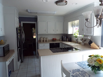
A tight space, and heavily lacquered wooden cabinets. Even though there's a huge bay window, this room and the tiny formal dining room beyond felt dark, and did not flow well. In mid transition, we decided to take the least expensive measures and see what paint would do for this space:


 The paint really helped freshen the whole feel of the space up and brightened things considerably. However the square footage was still a big issue..


One space saving idea was to build storage seating in the eating area. Still tight, but it was a nice little project.
Now the big ideas started coming into play and we realized, while all of these ideas were good ones, they still didn't solve the issue of space to the degree needed. While I was on this journey of changes, I did discover an awesome way to reface cabinets and if  you're interested check out this post:

Easy Cabinet Refacing Idea.

You'll love this easy technique and you wont believe how durable and lovely it is! It's a great refacing hack that you will want to do on all of your cabinets including in your bathrooms!

Now back to our program. You'll notice in the photographs there is a doorway opening on the far wall leading into a dark room. This was formerly a tiny formal dining room with only one window. It was stuffy, with no flow, and under used. No one wanted to go into this space. The good news was the wall between the kitchen and this tiny dark room was not load bearing. The solution: Tear down the wall and open up the space to create one large bright eat in kitchen.
Result:


Tuesday, August 9, 2016

Home Staging 101: Bed Making


Home staging is an integral part of selling your home. While some rooms in your home may only need a little nudge, many rooms may simply need a little more. When staging a home, one area I see falling short is in bedrooms. Where is the problem most of the time? It's in the owners lack of  bed making know how. It's not simply selling a house, you truly are selling to the potential buyer a lifestyle.

Bear that in mind and let it be the guide point for your inspiration when staging especially in the Master bedroom which should be the epitome of a lifestyle richly deserved. Knowing how to make up a beautiful bed can go a long way in how well your house shows, and what lifestyle the buyer can have if they purchase your home.  Here's a few tips for the home owner on how to address their beds, especially the Master Bedroom which is the star of all bedrooms.

1. Buy good quality bedding. I wont lie, I am a huge fan of Pottery Barn bedding. I love the feel, weight and quality of the bedding they offer and most of what Pottery Barn offers is wonderful with regards to organic materials.
2. Don't just one stop shop. I like to mix up things a bit. You don't have to get everything from one place to have a pulled together look. Look for bedding ensembles that offer you the ability to mix and match, and the option to purchase as many of a particular item as you need. We've all seen King size bedding ensembles that only offer ( 2 ) Euro Shams, and we all know three is needed for King sized beds. Why is the bedding industry not picking up on this? Luckily, Pottery Barn does offer you this option on most of their bedding products. When will the rest of the world catch up? In the photograph, the bed has a Paisley print duvet, solid sheets, and a matelasse coverlet. This keeps things interesting, but I did purchase the matelasse from JCPenney. It's a great way to add soft texture and break up a strong pattern like Paisley.
3. The 3 plus rule works well for King size bedding. What is the 3 plus rule? Simple, Starting at the headboard, 3 Euro Pillows as the background "plus"  2 King Pillows "plus"  2 accents, plus one final accent pillow in the front.  Bear in mind this is one suggestion, you can do others too, its just a good starting place.
4. Keep it simple if you're new at this. If you're a little worried about going all out, just remember to keep it simple. That means, simple colors, simple layers and simple accents. A well made bed does not have to have tons of pillows or lots of textures, but it does need to follow a simple formula. Look on websites, and see how the pros do it and then see if you can find a happy medium. Good luck with your house staging~

Open Concept Floor Plans: Is this always a one size fits all deal?

Why Open floor plans aren't always the best option


Open floor plans are no doubt something you've heard many times over. You've heard it when house shopping, you've heard it on renovation shows and you've likely seen examples of it in magazines. You've likely heard a lot of chatter about how desirable it is if you're selling your home or want to renovate. So there is no doubt this current trend is in full force and chances are it is going to be a permanent fixture in the world of home construction and architecture. 

You've heard the good. Have you considered the bad? Well, in spite of precious few articles and information on why it's not always the best choice, it really needs to be considered fully before you sign the dotted line or jump and make a quick decision. Here's some things to think about before you decide what you'd like versus what will work for your life, now and in the future.

In magazines, open floor plans look spectacular. In reality, open floor plans can make furniture placement, and decorating a nightmare. Walls not only provide you with a great place to display artwork or add storage via shelves, but they also help with placement of furniture. If you have the typical six piece set up for furniture, such as sofa/love-seat/end tables/coffee table, walls can give you more identifiable placement options. Usually big walls are ideal for sofas, mid-size for love-seats and so on. No walls means furniture must float in the room and this isn't always easy to do. Defining a focal point can be a challenge if you purchase a home that doesn't have a fireplace or some other obvious feature. One thing to also remember is open concept doesn't always equal large spaces. To "float" furniture adequately you must have enough space to navigate around each piece. Open concept smaller homes could possibly mean eliminating some of your existing furniture. Unless a home has electrical outlets in the floor you may find it challenging to have lighting from lamps as well.

Open floor plans can make it harder to keep little ones out of the kitchen. While you may want to be able to "keep an eye" on little Billy, having him underneath you while you're cooking could be an issue too. Falling, bumping and tripping over little ones can be a real safety hazard. Think you're off the hook if you're an “empty nester”? Not necessarily. Grandchildren will be running throughout your home as well which means constantly policing invisible borders between living spaces and kitchen areas and that can be exhausting as well. Don't forget, stoves with front knobs are easy to turn on for little ones and oven doors can get hot and hurt at that level too.

Open floor plans demand you be a little tidier than you may want to be. If you're not the tidiest of people, open floor plans are either going to make you step up your game and clean more diligently, or you're going to find yourself struggling to hide your mess.

 Something to think about as well. If you're an excellent housekeeper this would not be an issue, but if you're a busy mom or dad, this might be something to think about. 

The bottom line is this, don't be fooled by what may be the latest fad and assume this will be the best solution for you. There are no “one size fits all” floor plans and careful consideration of both now and future should be factored into any decision you make.


Wednesday, August 3, 2016

Why white is a timeless home design color choice


New color trends are emerging in interior design every day. One color that always shows up as a color choice in design is "white." In fact "white" is becoming the primary color in not only kitchens but throughout the home. No longer is "white" being designated as the go to "accent" color in spaces, but taking center stage. Thanks to home improvement shows like "Fixer Uppers" and others we're seeing an increased desire to use white with rustic overtones to create warm, yet timeless design.

refaced cabinets using wall paper
Photography by Dawn Gagnon
 While it's being called a trend right now, it's always been a classic and that means its typically safe on all sides of the coin in design. White, is not a new color in design or decor by any means, but today we're seeing more of it than in recent times and that suggests a desire for tranquil simple aesthetics. 


What makes this trend so popular and workable is that it has many advantages over traditional neutrals. Once you start looking at examples where white takes center stage in a space in homes, you'll see why.

Granted "white" may not be a good fit for everyone. Families with children may shudder at the idea of having too much white in any space. Visions of little hand prints, smudges and mystery smears may frighten many of us from such a color. However, white should not be excluded entirely. For example, contrary to popular belief white flushes out stains, streaks and smudges quite well in kitchens. If you use the right type of paint, clean up can be considerably easier as well.
 
The kitchen in the photo had cabinets painted in high gloss white. High gloss paints are usually ideal for kitchens and bathrooms for their ability to resist moisture, as well as better adherence to surfaces compared to semi-gloss paints. Clean up is usually superior as well since most any stains and smudges can be wiped off readily with a damp cloth.


Consider safer shades, like antique white if you find bright whites to be too stark. They are softer and warmer and still do a lot to brighten up a space. The chief advantage to all white pallets is the way the highlight your colorful accessories. Nothing will draw attention to your love of color artwork, accessories, and fabrics like white will. It can transition between contemporary and rustic very well too and that makes it extremely versatile for a design choice. 

Next time you're about to re-imagine a space, check out examples of these spaces where white is the primary color and see if it doesn't inspire you to give it a try.